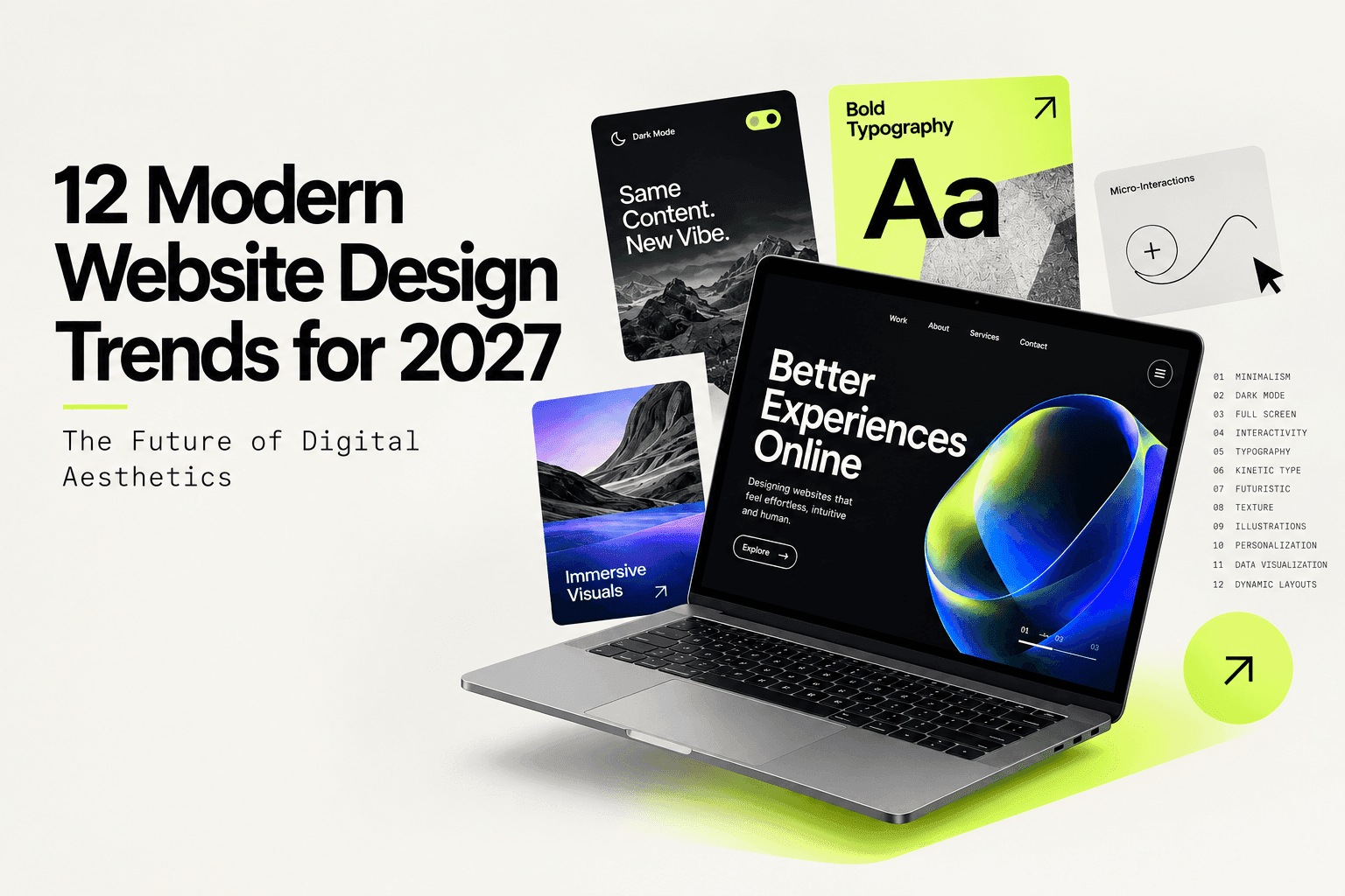
12 Modern Website Design Trends for 2027: The Future of Digital Aesthetics
A website is often the first place people form an opinion about a brand. In many cases, that first impression happens within seconds. Before someone reads your copy, checks your services, or explores your products, they have already noticed how the website looks, how easy it is to use, and how quickly it responds.
That expectation is only getting higher in 2027.
Web design is no longer just about making a website look modern. Users expect websites to feel fast, intuitive, relevant, and increasingly interactive. At the same time, brands are under more pressure to stand out without making their websites difficult to navigate.
This is one reason businesses are increasingly turning to dedicated website design and development teams instead of treating a redesign as a one-time visual exercise.
So, what does modern web design actually look like in 2027? Here are 12 trends worth paying attention to, along with where they make sense and where they may not.
The Top 12 Modern Web Design Trends
1. Minimalistic and UX-Focused Design
Minimalism isn't about making a website look empty. It's about removing anything that doesn't need to be there.
Clear navigation, enough whitespace, strong visual hierarchy, and fewer competing elements make it easier for visitors to understand what a page is trying to tell them. This becomes especially important on websites with a lot of information, where poor structure can quickly overwhelm users.
The goal is simple: help people find what they need without making them work for it.
2. Dark Mode Aesthetics
Dark interfaces have become common across apps, dashboards, and websites, and that familiarity is carrying over into brand websites as well.
Dark backgrounds can create a strong visual presence, particularly when paired with bright accents, photography, or motion. They can also work well for products and experiences where users spend longer periods on screen.
That said, dark mode isn't automatically better. Contrast, font weight, and accessibility still matter. A dark interface that looks great in a design file can become difficult to read once it's actually used.
3. Immersive Full-Screen Experiences
The first screen of a website has more responsibility than ever. Instead of a simple banner and headline, brands are using full-screen imagery, video, layered elements, and subtle parallax effects to create a stronger opening experience.
This works particularly well when the visual itself tells part of the story.
The important part is knowing when to stop. A full-screen experience should create interest, not force visitors to wait through animations before they can understand what the company actually does.
4. Advanced Interactivity and Micro-Animations
Small interactions can make a website feel noticeably more responsive.
A button changing as someone hovers over it, an image shifting slightly as they scroll, or content appearing at the right moment can make an otherwise static page feel more engaging.
These details don't need to be dramatic. In fact, the best micro-interactions are often the ones users barely notice consciously. They simply make the experience feel smoother.
5. Modern Typefaces and Variable Fonts
Typography is playing a much bigger role in web design than it used to.
The right typeface can influence how a brand feels before someone has read more than a few words. Variable fonts make this easier by allowing designers to adjust weight, width, and other characteristics without relying on multiple separate font files.
For brands, that means more flexibility without necessarily adding unnecessary complexity to the website.
6. Kinetic and Dynamic Typography
Sometimes the typography itself becomes part of the visual experience.
Animated headlines, scrolling text, oversized type, and changing text treatments can give a page more energy and draw attention to important messages.
This approach works particularly well for campaigns, creative brands, portfolios, and product launches. For more functional websites, however, motion should support the message rather than compete with it.
7. Sci-Fi and Futuristic Design Elements
Gradients, glowing accents, abstract 3D shapes, glass-like surfaces, and futuristic visual treatments continue to appear across technology and innovation-led websites.
For the right brand, these elements can immediately communicate ideas like experimentation, technology, and progress.
But there's a catch: futuristic design can become generic surprisingly quickly. If every technology company uses the same neon gradients and glowing shapes, the visual language stops feeling distinctive.
8. Noise and Texture Overlays
Perfectly smooth digital surfaces can sometimes feel a little too polished.
Subtle grain, noise, blur, paper-like textures, and other tactile effects can introduce depth and make a layout feel less sterile. They're particularly useful when a design needs some character but doesn't need another large visual element.
The key is subtlety. Texture should support the composition, not become the composition.
9. Custom Illustrations and Brand Characters
Stock photography is easy to find, which is also exactly why it can make brands look interchangeable.
Custom illustrations, graphic systems, icons, and brand-specific characters give companies a visual language that belongs to them. They can also make complex ideas easier to explain without relying entirely on photography.
This is especially useful for brands that want to build recognition across their website, social channels, presentations, and other digital touchpoints.
10. Hyper-Personalization
People are becoming used to digital experiences that remember what they have done and respond accordingly.
Websites can use information such as browsing behavior, location, previous interactions, or customer status to show more relevant content and calls to action.
For example, a returning visitor may not need to see the same introductory message as someone visiting for the first time.
Personalization can make a website feel more useful, but it needs to be handled carefully. Too much personalization can feel intrusive, while poorly implemented dynamic content can create a confusing experience.
11. Interactive Data Visualization
Numbers are not always easy to understand when they're presented as blocks of text.
Interactive charts, maps, graphs, filters, and hover-based details give users a way to explore information at their own pace. This is particularly useful for B2B, SaaS, financial, research, and technology websites where data is an important part of the story.
Instead of asking users to interpret a wall of statistics, good visualization helps them see the story behind the numbers.
12. Dynamic Grid Layouts
Traditional website layouts are becoming less rigid.
Asymmetrical grids, overlapping elements, editorial-style layouts, and masonry structures can make pages feel more distinctive and give designers greater freedom to create visual hierarchy.
They can also make content-heavy pages easier to scan when used thoughtfully.
The challenge is keeping that creativity grounded in usability. A layout can be unconventional without making visitors wonder where they are supposed to click next.
Modern Website Design Principles in Action
Trends become more useful when you look at how they work in a real website rather than treating them as isolated design ideas.
The E-Commerce Experience
An e-commerce website could combine large product imagery, subtle animations, product zoom, and a dynamic grid to make browsing more engaging.
But the checkout experience should remain straightforward. There is little value in an impressive product page if users have to fight their way through the purchase process.
The SaaS Dashboard
A SaaS platform may benefit from dark mode, interactive data visualizations, clear alerts, and lightweight motion that helps users understand what's happening.
Here, design has a functional job. Every visual decision should make the product easier to understand or use.
The Creative Portfolio
Creative portfolios have more room to experiment. Custom illustrations, unusual layouts, large typography, texture, and unconventional navigation can help establish a strong visual identity.
The important thing is that experimentation still needs a purpose. Visitors should remember the work, not just the effects used to present it.
How to Implement These Trends in 2027
You don't need to rebuild your entire website around every new design trend.
A better approach is to look at your existing experience and identify where users are struggling or where the site feels dated. From there, choose the design changes that actually solve those problems as part of a broader digital strategy.
A few things are worth keeping in mind:
- Start with mobile. If an animation, layout, or interaction doesn't work well on a smaller screen, it needs to be reconsidered before desktop becomes the priority.
- Protect performance. Large videos, heavy animations, and high-resolution assets can quickly turn a visually impressive website into a slow one.
- Build for accessibility. Check contrast, font sizes, keyboard navigation, motion, and screen-reader compatibility instead of treating accessibility as a final checklist.
- Test what you change. Not every animation or interactive feature improves the experience. Analytics and user testing can tell you whether a change is actually helping.
- Don't chase trends blindly. A design trend should make sense for your audience and brand. If it doesn't, leaving it out is often the better design decision.
Key Takeaways
- Minimalism is about clarity. A simpler interface should make the experience easier, not simply make the page look cleaner.
- Dark mode has practical uses. It can improve comfort and create a strong visual style, but it still needs careful accessibility work.
- Interaction should have a purpose. Motion is useful when it guides, explains, or responds to the user.
- Mobile comes first. A design that only works beautifully on a large screen isn't a successful modern website.
- Personalization needs balance. Relevant experiences can be useful, but users should never feel like the website is watching everything they do.
FAQs About Modern Website Design Trends 2027
What is the biggest website design trend for 2027?
There isn't one trend that works for every website. Personalization, accessibility, interactive experiences, and performance-focused design are all becoming more important because they directly affect how people use a website, rather than simply how it looks.
Is dark mode necessary for every website?
No. Dark mode can be a useful option, particularly for products and websites where users spend a lot of time on screen, but it isn't something every brand needs to implement. If you do use it, make sure text contrast and readability remain strong.
Do I need to implement all 12 trends at once?
Definitely not.
A website doesn't become modern simply because it has more animations, unusual layouts, or visual effects. Start with the areas that matter most to your users and business goals, then introduce additional elements where they genuinely improve the experience.
How does personalization affect website performance?
Personalization can make content more relevant, but dynamic experiences also need to be technically well implemented. Poorly optimized personalization can add unnecessary requests and slow down a page.
The solution isn't to avoid personalization altogether. It's to make sure the underlying implementation is efficient.
Does prioritizing animation and interactivity hurt SEO?
It can if those elements make the website slower or interfere with content accessibility.
Large media files, excessive JavaScript, and poorly optimized animations can affect performance and user experience. That's why design decisions should be considered alongside technical performance and ongoing SEO work.
Where should a business start when updating an older website?
Start by looking at the fundamentals.
Check whether the website works properly on mobile, whether visitors can find important information quickly, whether pages load efficiently, and whether the experience is accessible.
Once those areas are in good shape, you can start introducing newer visual and interactive elements where they make sense.
Conclusion
Modern web design isn't really about adding every new visual trend to a website. It's about understanding what people now expect from digital experiences and deciding which of those expectations actually matter for your audience.
Dark mode, kinetic typography, immersive visuals, personalization, and interactive content can all make a website more engaging. But none of them can compensate for confusing navigation, slow pages, inaccessible content, or a poor mobile experience.
The strongest websites in 2027 will be the ones that balance visual character with usability. They will feel distinctive without being difficult to use, interactive without being distracting, and personalized without becoming intrusive.
If you're planning a website redesign or aren't sure where your current site stands, the team at WebMaffia can help you assess the experience, identify the gaps, and build a practical roadmap for improvement. Get in touch to discuss what makes sense for your website.
following blog articles.